Sunday, July 28, 2013

Just Breathe


We put so much pressure on ourselves as Creatives to produce and it comes from many directions. Have you heard these thoughts whiz through your head before?

I am not good enough? 

This isn't right. 

They won't like it. 

This is crap. 

Ugh, I can't do this. 

and so on and so on. Striving for excellence as an artist comes with an internal dialogue that each of us must fine tune so that it serves us. Working hard, putting in the hours to master a skill, those things are very much needed. What doesn't serve us is the mindset that stems from the statements above. What we feed ourselves internally will come out in our bodies, that goes for the physical and the mental

Sometimes we need to simply breathe.... let the expectations go and create from a place of play, joy, and fun which feeds us internally. We are our first audience. 

#flipyourmindset 
#createforfun     


Monday, July 8, 2013

New Studio


Woooohooooo! For the first time since I have been a professional artist I actually have a full blown working studio. My son moved out into his own place a few weeks back which was quite a bittersweet moment for me. I loved having him at home, but see him become independent was such a joy and I am grateful he is transitioning into this new chapter. He and I shared a room...I mean, his bedroom was half my studio, so when he moved, I was able to totally embrace the space as my own. 

BEFORE PICS! (What a mess!)


For those who have followed me you know I paint often in my outdoor studio, from my carstudio, in my kitchudio by that great window, but having my own studio space eluded me. There is only so far you can take your creativity when space is an issue, and I learned to master the art of painting in a small space. This new studio will be a unique experience for me. I set it up with great intent, meaning I sat in my chair for several days and visualized exactly what type of art and what materials I would need in reach. 

AFTER PICS - (Wooohooo!)


Love having my paints in reach!


Plenty of room for a decent size canvas. 


Organizing my plan was key, and this gave me the freedom to open up boxes and materials I have not seen in years. There is pretty much a place for everything, and although I wanted to keep the space cozy and pretty, it had to serve two purposes...a guest room and my studio. Creating a space that is too pretty to work in was not on my agenda, but displaying my supplies was something I tried to do in a practical, but visually pretty way. 


Love my old, vintage paintbrush.


Alice loves the little hands, :)


Three days of packing his items up and unpacking mine, moving furniture, throwing away gobs, and relishing over the memories of it all was a beautiful experience. There were moments that I stood in that doorway and remembered my little five year old playing with his James the Red Engine and Thomas the Tank Engines. That room holds lots of memories, and I cherish the fact that my creative space is surrounded by them all. Tonight I placed the final three boxes needing to be sorted in the closet, looked around and realized I need to start collecting and displaying my friends artworks, and took a really deep breath. This room will always grow with me, it will change as my art changes, but one thing is sure. When any of our children return for a visit, there will be a warm, welcoming space for them surrounded by lots of creative fodder. I can think of no better use for a studio! 


I still have many of his boyhood items to keep me company, :) 


You can see my to do list on the cardboard.


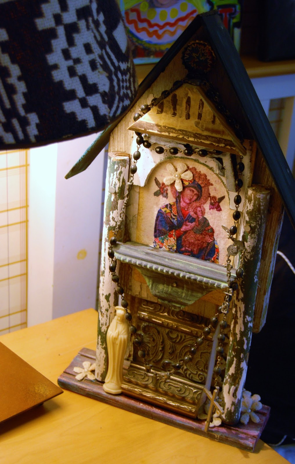
Provie Musso built this amazing piece, I adore it!

A few various art pieces from some of my besties! The one on the right is from my nephew Simon, who is 3. Sweet Wendy painted me the cross, and the rabbit was salvaged from the trash when Art(ology) opened. 

Of course, there must be random doll parts. 


I still have things to hang, but overall, it is looking sweet! 


Wednesday, June 12, 2013

The Impression of Proust Art Journal Page

Proust is not a writer I am well read in, not at all in fact, but I am aware of the quotes he is known for that appear in my streams on social networks quite often. When I turned my journal to the page showcasing the portrait done just before his death, it made me stop, pause, and wonder enough to take a closer look at his influence, and his impact in the written word. 


There were a few quotes that resonated with me, especially those relating to illness, and I felt a quick connection to him for the simple commonality we shared in that regard. With that said, I wasn't ready to oogle over him until I had studied enough to form a better opinion, so I spent some time sketch and considering the limited info I had about him. 


I started with sketching the robot that I adore, and opted to look in the mirror and do a quick sketch of my face. Wasn't trying to nail the likeness, just wanted to get the structure somewhat solid. I then chose to give each figure a space ball helmet which reflected encapsulating ideas, thoughts, memories, and feelings. 


The more time I spent painting my journal page, the more I realized how much I wanted to know more about this writer. His words resonated with me, of illness, of love, of overcoming challenges, and of intellect. I thought the juxtaposition of the automated robot was tell tale in that living life to the fullest can not be accomplished if we simply go through the motions, so I was pleased with the play on images as well as words in this. 


The colors and patterns of text I find interesting on this page and I am swooning over the mix of pink these days. Not sure why, it is just a color that I am loving and get excited about lately. The use of satin acrylics and Chart Pak Ad markers are still my favorites, and I also threw in some Molotow paint pens as well. This journal is coming along nicely and is turning out to be a work of art that is revealing a bit about myself as an artist and opening the gigantic world of art history quite well. I am glad for both. 

You can view the entire journal here!

Tuesday, June 11, 2013

Lorina, Lorina Art Journal Page

My Mixed Media Intensive class kicked off today so for the next 6 weeks, every Tuesday a great group of ladies will be applying the skills they have learned in the past classes and creating a body of work. This thrills me because nothing pleases me more than seeing artists find their voices, discover techniques they love, and create a cohesive series that shows their confidence and growth off. 


One of the things I had them try out today was using pipe insulation to wrap around their brushes for a much looser, painterly touch. The experience was good to show the difference in a controlled brushstroke compared with a looser one. I love the loose touch, especially for the beginning layers in a piece and I think they understood the value of the hand position shift as well. 


The heat was pretty oppressive today so as I sat down with my journal my thoughts turned to lemonade. I didn't have any, but I did have my lovely Lorina bottles so I chose the one filled with Pantone's color of the year, Emerald Green, to sketch. I wanted to stay loose, so I quickly sketched within a 2 min time frame each bottle with a Neocolor II crayon and then added water. I also wanted to try out my Valspar paint samples from Lowe's and I have to admit, I LOVE THIS PAINT! It is satin, goes on relatively flat, and my Chartpak Ad Markers glide over the paint like butter, as do the Neocolors and Golden Fluids. I may never use little, cheap acrylic paints again because for 3 bucks, this size and quality of paint can't be beat. 


This was the page I worked on.


I created a color swatch sample on my page to give myself a guide of color choice and used a limited palette of blue/green and pink/magenta. The tiny hints of red are juicy tidbits. This page was fun to do, no brooding ideas, no attempt to capture perfection, just a few minutes sketching and moving paint, while enjoying the beauty of this bottle and the thoughts of a great glass of French Limonade. 


Today was filled with beautiful people and art, two of my favorite things on the planet. 

Monday, June 10, 2013

The Illusion of Beauty Painting

A friend asked me if I painted totally intuitively or if I had a plan and the answer was yes, and yes. What I mean by that is, I paint within a framework and then let the intuitive nature of the piece evolve, so I do both. When I first started just painting on the fly, I made a mess, not a pretty mess, and wasted a ridiculous amount of paint. That led me to rethink the process and consider how I could adapt my practice to still explore the intuition, but within more of a set framework, and I love this process. 


I had in mind three pieces of a framework for this piece, the color palette, the loose brush strokes and runs, and I wanted to sketch myself looking in the mirror. Past that, I was open to where my spirit would take me and where the images would as well. At first, it was simply fun to sketch, not a pretty attempt, but to capture the face quickly felt solid and done. I then began to reflect on my colors, and rather than force a mood, allowed the colors and line to influence the mood. 


What occurred to me as the main figure evolved in comparison to the ballerina was that there was a juxtaposition between the concept of beauty, and how that might play out to someone struggling with their inner self. The expression can be taken in a number of ways, and I leave that for the viewer to decide. Ultimately, the dialogue of emotion and mood compared with the looseness of the line and color work to convey or move the viewer. Regardless of direction, I am totally pleased with the idea that pretty is not what I aimed for. 


This piece is 4 feet by 4 feet and is filled with many details that can't be seen digitally. If you are local and head out to Artwalk o the 14th, stop by Art(ology) and you can see it there, in all its beauty ;)


After letting this piece rest in the gallery over the past month I felt inclined that it had served its purpose but was so not meant to remain melancholic. I opted to work through it in a figurative way, keeping the name, but embracing the abstract nature of beauty rather than the melancholic approach to the painting above. I love my changes, always eager to not marry a piece of artwork before its time, and ever so willing to embrace change. 

Worked on the marks and layers at Art(ology)

Finally finished! 
3 feet by 3 feet acrylic on canvas, "The Illusion of Beauty"


Saturday, June 8, 2013

Three Studies, One Size


Do blank canvases intimidate you? Depending on the size and the deadline they can emanate an ominous brooding in my world, and I tend to want to just squirt them with something to knock them down a notch. Today, rather than squirt paint, I grabbed my art journal and three smaller, much smaller (4" by 8"), canvases along with a few reference photos and sketched some ideas out. What you see here are the three studies, each completed in about 20 min because I didn't want to over think the process. 


What I gained from these three is that although the color palette in my journal works well there, for my larger canvas I want to go lighter, much lighter. In fact, as much as I like elements of these three small pieces, they make me want to grab the gesso and ghost them out. That tells me that the direction of my larger piece will go lighter. I will still use my charcoal and graphite, but I hope to use tints of color rather than pure pigment. 

I dig the obtuse lines and posture. 

Would have like to have captured more movement in the figure.

Love the posture of this figure, may go with it. 

The large canvas is 4' by 4', lots of room to move paint, embrace emotion, and make marks. Hope your Saturday is beautiful friends. Mine is swell! 

Friday, June 7, 2013

The Face of Scorn Art Journal Page

This page flew into submission, unlike the figure on the page, lol. Rather than going completely by the seat of my pants, I had two distinct techniques to work on with this page, first, I wanted to use a warm color palette for the most part and second, I wanted to add spheres to alter the depth perception. Beyond that, I was pretty unclear about which way to head, so I opted to sketch two heads and a bird....just for the helluva it.


As the faces evolved, I started to sketch the chair in front of me as well, and when I got a hint of the emotional tension between the two figures I decided to add a birds nest in the chair between the two, just to add to the connection of life, possibility, and safety. 


Golden fluid acrylics were my first round of paints and my Copic marker just flows on like butter, so I can safely say those two combinations are my favorite. In addition to that, I added a little coffee to my titanium white to flesh up that color and antique a few places. 


Before I added the text I thought long and hard about what should go inside the circles. Because I wanted to bend my text a little I chose to put the text in them, and since I loved this look so much I will be using this technique in some canvas work, therefore, the sphere test paid off. 


There is no personal message on these pages, just a play on words from what was there, The Sound of Silence, and what I created. This page taught me the value of this color palette and the value of the depth of spheres, two skills I will be using often. 

You can view my entire journal process on my FB Album Here

Layers of What If Art Journal Page

Usually, I create a page in one sitting, or at the very most, two on the same day but this page was a bit different for many reasons. This page was full of fear, trepidation, hope, courage, and a whole lotta praying with faith. This page spanned the week, between days of what ifs, moments of I can'ts, and lots of space in between listening to that quite voice saying, "Be still, trust, have faith." This page is the hope of what could be with the knowing of now, and going slow through the process gave me great insight into how my artistic mind collides with my responsible mind every day. 


It started off like most of the others until the phone rang with unexpected news. It was perplexing, so I turned that energy towards the pages because the two page spread was a bit odd itself. Creatively, it spoke little to me, other than the framework of the building and the geometric lines. No vision, no direction, nothing, nada....just me and my soup of awkward feelings so I began to do what I do...sketch, collage, gather, and place. 


Throughout the process over several days my emotions ran the gamut from jubilation to despondency and everything in between and the page seemed to sense that. There were moments of mud, moments of chaos, moments of I haven't a clue where to take this, so I let it rest a day or two and began to consider just what I needed this page to teach me...I began to listen to it. As I did, I quietly started to collect words and phrases that tickled the little grey cells and placed them randomly. I also sketched favorite items in my line of site, the clock on the mantle, a paint jar, a glass sphere on a candlestick, and the bike. Sketching felt good, but still, it all echoed with bleh...


The next day rolled around and as it evolved into connecting me with a world that I had long missed something wakened inside my heart with the vision of being bold in my not knowing. That was important, the connecting with what was already within, and I ever so gently began to realize that this journal page was meant to shine a light on what it means to trust with grace, walk with faith, and step boldly into an unexpected possibility. The entire process was taxing, but oh so beautiful. 


You see, I believe the act of creating is a pathway to connect with my maker and the moments I choose to let go and listen to Him, I am shown glimpses of what walking this planet is all about, and they are sacred. I wish I could tell you that the week turned out to be filled with great achievement but that wasn't the case. It did turn out to reveal a lot about what I needed in the moment, it helped me tinker with an odd color palette, and gave me the space to consider when a painting seems disconnected that there is always a thread hidden somewhere. 


I love this page, not because it is pretty, but more so because it reminds me that life is beautiful, surprising, and filled with wonder and looking for the moments of grace in life is often the most important thing I can do. Lovely things to be reminded of. 

TO SEE THE ENTIRE JOURNAL GO HERE